Redlands Massage Therapy
- A full Targeted Communications Plan
- A full branding package, including logo re-design and print collateral
- A new responsive website
Our first step was to develop a full Targeted Communications Plan for Redlands Massage Therapy. We conducted interviews with RMT's leadership in order to identify the business model, value propositions, target markets and communications objectives. From this analysis process, we were able to develop a conceptual approach to the new logo.
We simultaneously worked through a copyediting process with RMT’s leadership to ensure that all of the new content that would be used in the new website and marketing collateral would support the core messages and value propositions.
The Targeted Communications Plan informed what marketing collateral was needed based upon the target markets and the channels RMT uses to reach them. We produced a new responsive website, a bi-fold brochure, two rack cards, business cards and letterhead for RMT.
The finished work was significantly enhanced by a third-party photographer and videographer RMT commissioned independently for professional photography and a professional promotional video, respectively.
- White Tail Cinema
- Professional Photographer
- Adobe Illustrator CC
- Adobe InDesign CC
- Adobe Photoshop CC
Collateral
|
Logo
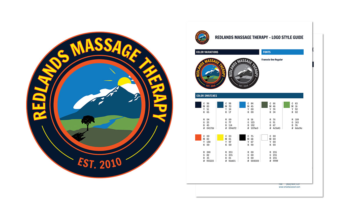
The overall look and feel of the logo was inspired by what we know today as vintage design. We wanted to capture the essence of historic downtown Redlands, as owner John Webster had expressed the importance of his business being rooted in this location. The font and color scheme are the intended to help capture this look and feel. The circular, symmetrical shape, like a seal, is also very vintage. On the inside of the circle, an abstract scene appears that is both representative of the location (in the valley with the mountains in view) and symbolic to the nature of John’s medical massage therapy practice. The tree represents life and vitality, with growth rings it can be equated to the past (good and bad memories, traumas, etc.) that human beings carry with them for the rest of their lives. The sun represents new beginnings, a new horizon, as is the potential of going through the healing process. |
|
|
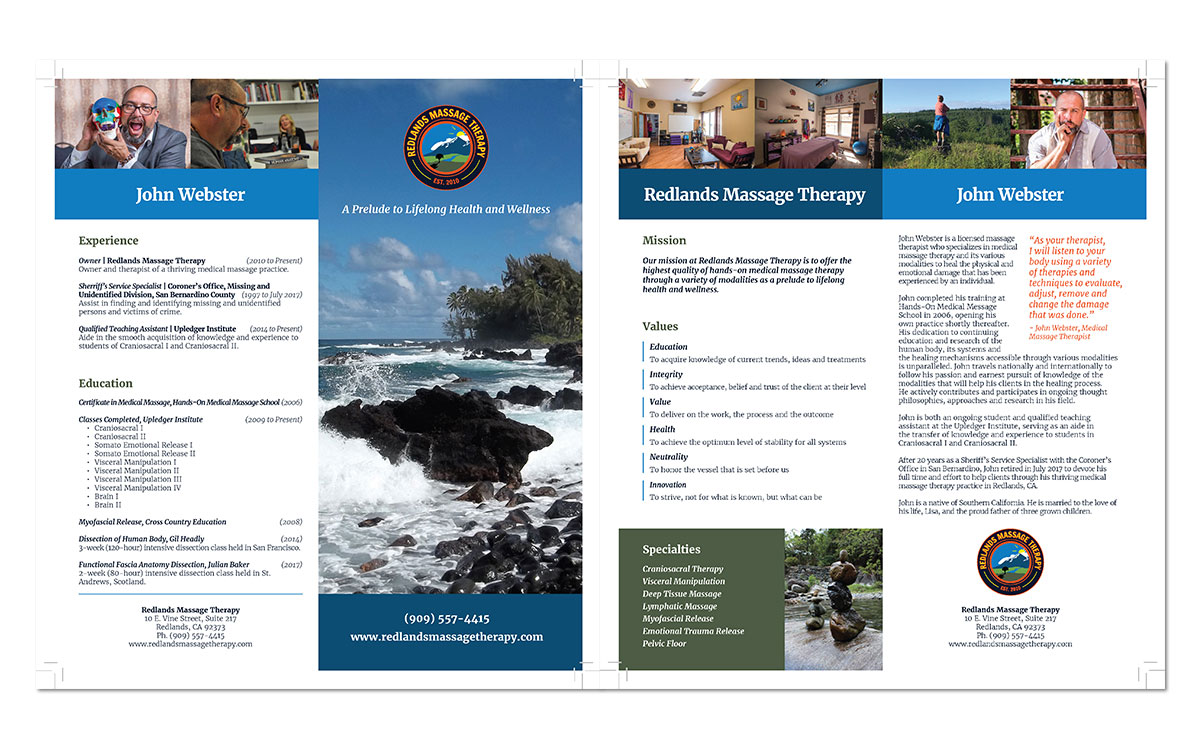
Bi-Fold Brochure
The bi-fold brochure introduces readers to RMT's mission and values as well as provides information on owner John Webster's background and education in medical massage therapy. |
|
|
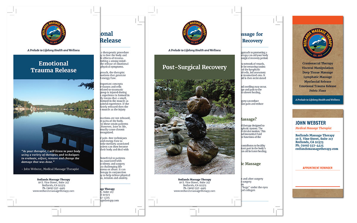
Rack Cards
We designed a rack card template that could be inserted into the bi-fold brochure. The purpose of each rack card is to promote a specific modality of medical massage therapy. RMT may insert the rack card with information on the relevant modality into the standard bi-fold brochure as relevant to the prospective customer. |
|
|
Business Cards
A portait orientation business card provides RMT's contact information as well as space for writing down the client's next scheduled appointment. |
|
|
Letterhead
The letterhead is in a word document template so that it can be easily and conveniently used for letter correspondence from RMT. |